
These days, going green is a must for CPG brands, but while environmental consciousness is at an all-time high, so is consumer skepticism. Years of exaggerated claims and vague buzzwords have led to the rise of eco-cynicism, where even genuinely sustainable brands now face distrust. The heightening awareness of greenwashing poses a new challenge for designers: how to visually communicate sustainability in packaging that feels honest and emotionally engaging.
Design must go beyond surface-level signals to deliver tangible proof of a brand’s environmental efforts. This blog explores key design strategies that can help brands bridge the gap between brand promises and consumer trust.
Why Eco-Cynicism Is Growing?
Consumers are no longer taking sustainability claims at face value and with good reason. A 2025 study revealed that only 20% of consumers believe brands accurately reflect their environmental efforts. This deepening mistrust is often fueled by weak or misleading design choices that undermine credibility, some of which include:
Empty buzzwords: Terms like “natural,” “green,” and “eco-friendly” are regularly used without context or proof, making them feel hollow and performative.
Generic visuals: Stock icons, such as floating leaves and vague recycling symbols, have become visual clichés.
Cluttered communication: Overly dense copy and cluttered infographics can overwhelm rather than inform. If the sustainability message isn’t immediately clear and accessible, consumers are quick to dismiss it.
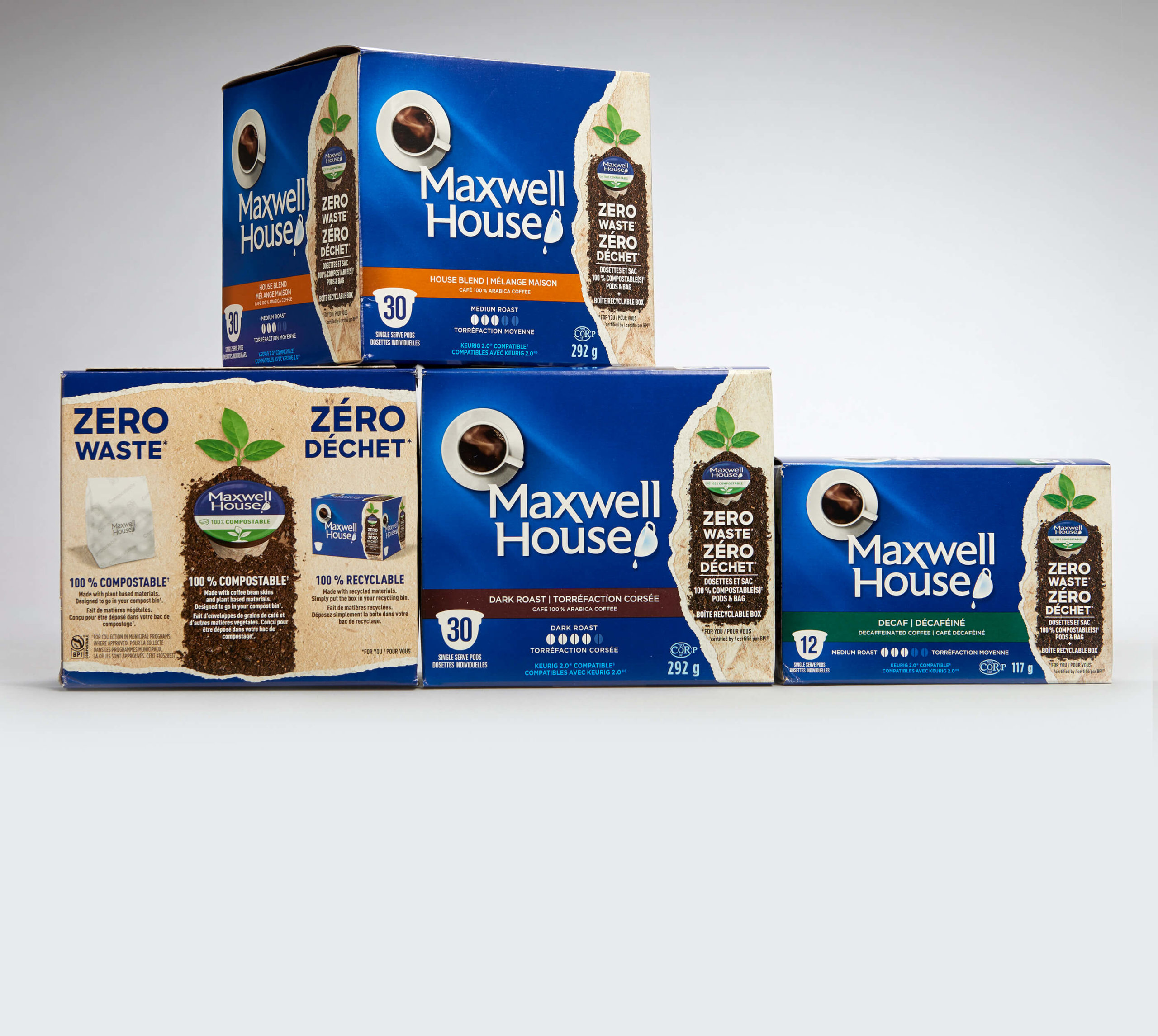
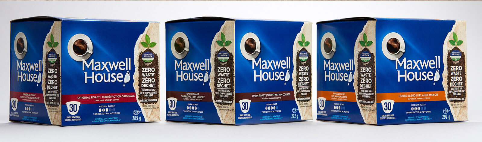
Maxwell House
Our Blink Factor approach focuses on creating eye-catching design with an immediate emotional connection. When it comes to communicating sustainability, this means helping consumers feel a brand’s values before they read a single word.
A strong example is Maxwell House’s packaging for its zero-waste pods. In an era where greenwashing has made consumers wary, the brand prioritized transparency and detailed information to build trust. The design features a strong front panel with a striking tearaway design that puts the zero-waste promise front and center. The use of textured paper design and a splash of green visually disrupts the traditionally monotone dark coffee aisle. At the same time, it reinforces its sustainable message. On the back and side panels, the storytelling helps educate consumers on how to properly dispose of each component, empowering consumers to participate in the zero-waste journey.
Image Source: SLD
Three Key Blink Factor Design Strategies for Effective Sustainable Packaging Design
1. Strengthen Messaging through Storytelling
Storytelling has the power to create an emotional response, simplify complex information, and give consumers a reason to care. It begins with a bold claim or a striking visual that captures attention, often placed right on the front of the packaging. This initial hook draws shoppers in, but the true strength of the story lies in what comes next. As consumers explore further, the design should guide them through a clear, logical flow of supporting messages, which can include visual explanations, material callouts, sustainability claims, and actionable instructions that deepen understanding.
Equally important is how the story is told. A concise narrative that avoids excessive jargon makes the message feel authentic and approachable. Showcase shared values, such as reducing waste, supporting local sourcing, or using responsibly sourced materials. Pair these values with practical steps that the consumer can take. This kind of storytelling doesn’t confuse or preach; it instead invites participation.
2. Integrate brand personality
When every package starts to look the same, brands risk losing their voice and connection with their consumers. To earn trust, sustainability graphics must reflect your brand’s unique visual language. Instead of overhauling your look to “go green,” find creative ways to embed sustainability into your brand’s existing design identity.
While we don’t recommend abandoning recognizable sustainability symbols altogether, we do suggest reimagining how they’re used. Develop custom graphics that align with your brand’s tone, style, aesthetic, and, of course, the product at hand. For example, a brand with a bold, modern identity might redesign the recycling symbol with clean geometric lines and a punchy color palette. A brand known for whimsical illustrations could communicate compostability through playful instructional visuals. By incorporating your brand’s personality into your design and messaging, you send a signal to your consumers that sustainability isn’t just an afterthought but an integral part of the brand.
3. Use graphics and icons to educate, not decorate
Replace decorative clutter with informative design that empowers consumers. The design elements that make effective sustainability graphics include:
Clarity and Simplicity
Icons and imagery should be immediately understandable without explanation. For example:
- A compostable icon should be distinguishable from a recyclable one.
- Simple shapes, minimal lines, and high contrast should help the icon pop.
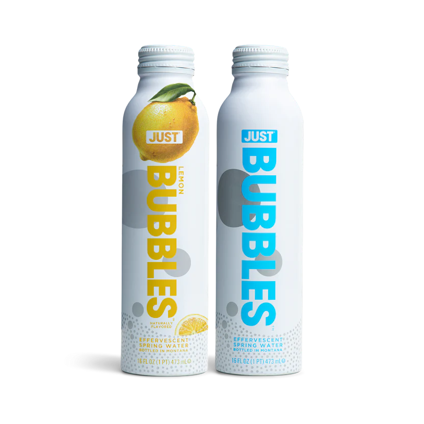
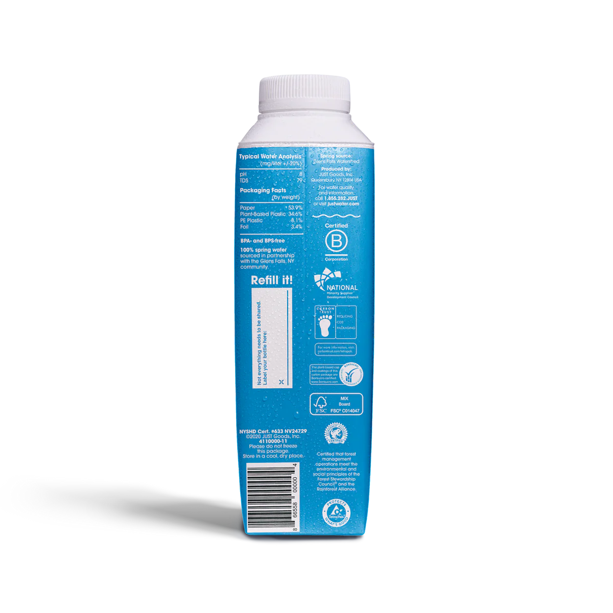
Just Water
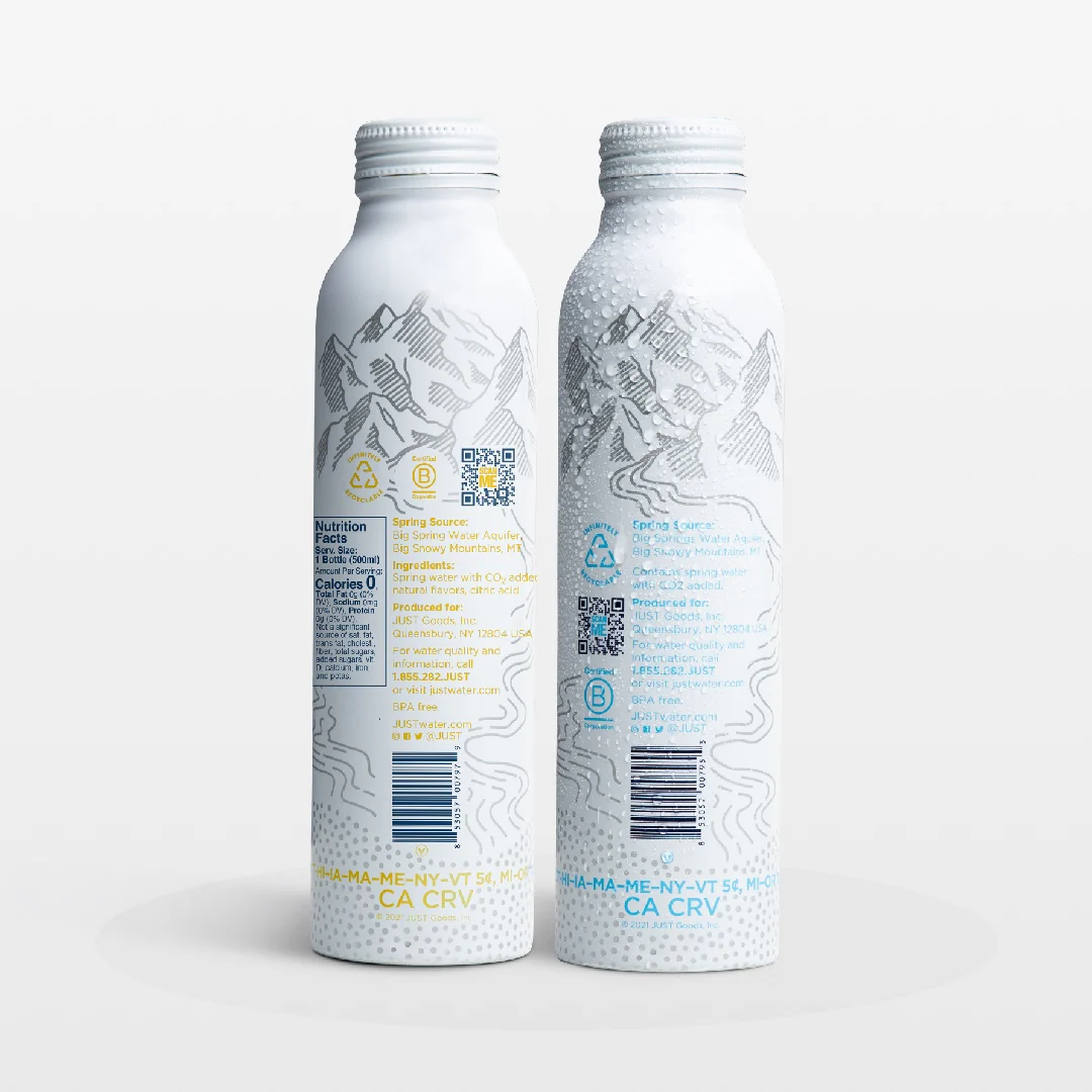
Just Water’s sustainable packaging solution is clear, genuine, and appeals to consumers in both an economic and pragmatic way. Its design and messaging are as pure and minimal as its name implies. The brand places its sustainability mission front and center, integrating statements like “Made of Aluminum… Please Recycle It” directly into the consumer experience. Using straightforward graphics and concise text on its bottles, Just Water communicates its environmental values with simplicity. A restrained color palette ensures that key information stands out without overwhelming the design. Instead of relying on cliché greens or generic eco-symbols, the packaging allows its message to shine through a clean, confident design language that reflects the brand persona. In doing so, Just Water turns its packaging into a medium of persuasion, reinforcing that choosing its water is not only a great refreshment choice but an ethical one.
Image Source: Just Water Official Website
Functional and Informative
Icons should serve a clear purpose, such as explaining how to dispose of the package, what it’s made of, or its environmental impact. For instance, Maxwell House packaging displays a visual of the pod, labeled “100% compostable”, with supporting text that explains the material composition (made with plant-based materials, etc).
- Pair icons with clear text
- Include QR codes that link to more info (especially if your claims require nuance).
Visual Hierarchy
It’s best to place sustainability graphics where consumers naturally look, near the product name, ingredient list, or callouts. They should not be buried in the fine print or other elements on the pack. Consider:
- A badge-style format that helps guide the eye
- Grouping multiple eco-icons for better visibility
Emotionally Resonant
Beyond information, icons and graphics can evoke feelings, such as optimism, progress, or care. This can be achieved through:
- Soft, organic shapes for nature-forward messaging
- Hand-drawn illustration styles, for a human touch
- Color cues like earthy greens, sand tones, and warm neutrals (but used thoughtfully to avoid blending in or looking generic)
Invest in Sustainable Design That Resonates Emotionally with Consumers
Design’s role in sustainability communication is to create a deeper emotional connection and more credible brand experiences. As eco-cynicism becomes the norm, the brands that will stand out are those willing to invest in design that consumers can not only see but also feel the green-forward impact.
