Aisle Adventures —
Here’s How
A modern re-design for Home Hardware’s in-store wayfinding system.
Home Hardware
Wayfinding design
Wayfinding
Environmental Graphic Design
Research & Insights
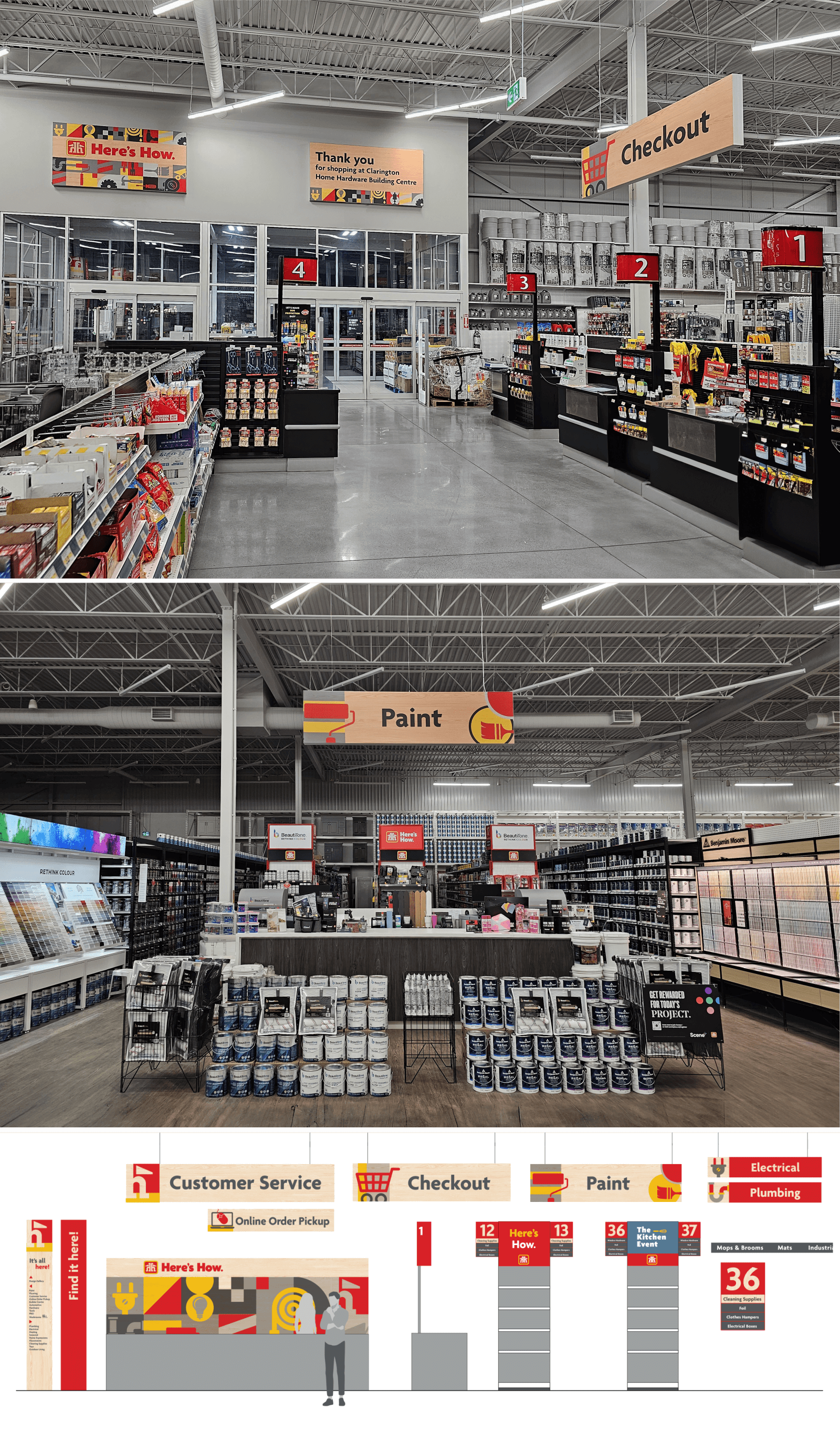
Home Hardware’s competitive advantage lies in the service experience provided by franchise owners, who take great pride in their business. Local owners know their region well and have the freedom to decide what best meets their customers’ needs. However, a unified brand is also a powerful tool. Home Hardware was looking for a solution that would help them bring unity to the store experience while helping franchise owners organize their stores and helping shoppers navigate.
A wayfinding system and signing package was a simple, tactical solution that could enhance in-store navigation with modern, streamlined signs, while also creating a strongly branded visual. The solution would be cost-effective for franchise owners, while also ensuring a cohesive look and feel for the brand.
SLD created four directions for the wayfinding system, which we took into consumer research for insights on users’ response to the personality and tone of the graphics. The feedback informed our goal to fulfill customers’ desires for a modern yet legible and approachable shopping experience.
The signs feature a clean, sans-serif typography with custom icons to replace photographic imagery and logos, enhancing visual clarity and aesthetic appeal. Behind-the-desk graphic patterns and redesigned “thank you” signs near the exits add warmth to the store environment, along with the wood background for most signs. This new wayfinding system not only echoes Home Hardware’s brand guidelines but also introduces flexibility in adaptation, emphasizing an artisanal look and feel that resonates with today’s home improvers.