BUILDING A BRAND ONE SMILE AT A TIME
Canadian Orthodontic Partners
docbraces Brand & Retail Design
Visual Identity
Retail Design
Environmental Graphic Design



THINK
The Canadian Orthodontic Partners (COP) knew the challenges faced by independent orthodontic clinics. Practitioners are so bogged down by running the business, they often struggle to focus their energy on what they truly love: patient care. By offering a complete suite of services to support independent clinics with business needs such as scheduling, payroll and marketing, COP could free up practitioners to do their best work. Enter docbraces, a new brand built of many independent clinics across the country.
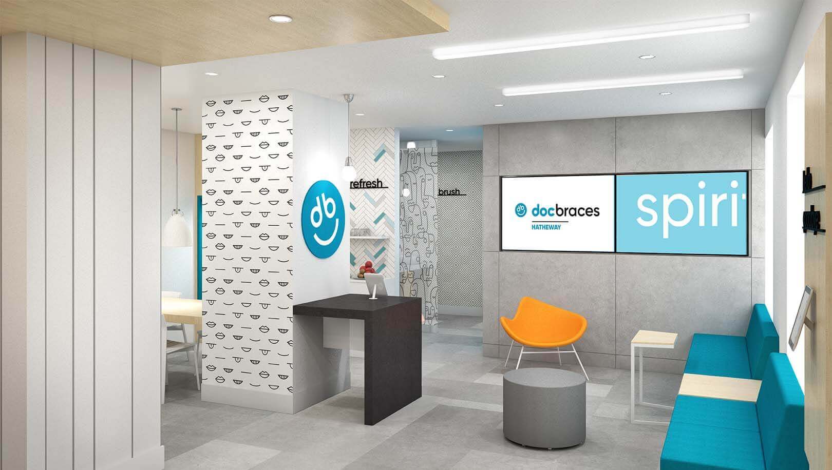
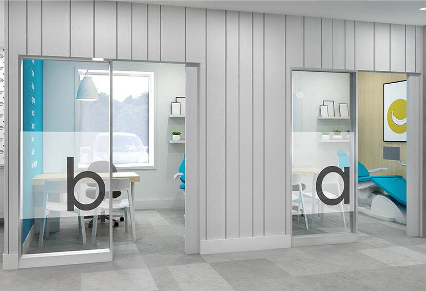
To build a brand platform that could unite many small operators who have been successfully running for many years, being flexible was key to our process. The docbraces brand required a strong visual identity that could be easily applied to various touchpoints, including the physical clinics. All of this had to be done with minimal disruption to operations and without sacrificing the equity these independent operators have in their own communities. Ultimately, we needed to provide a kit with many parts that could be applied in many ways to meet the needs of each clinic, while also maximizing the strength of a united brand.


BLINK
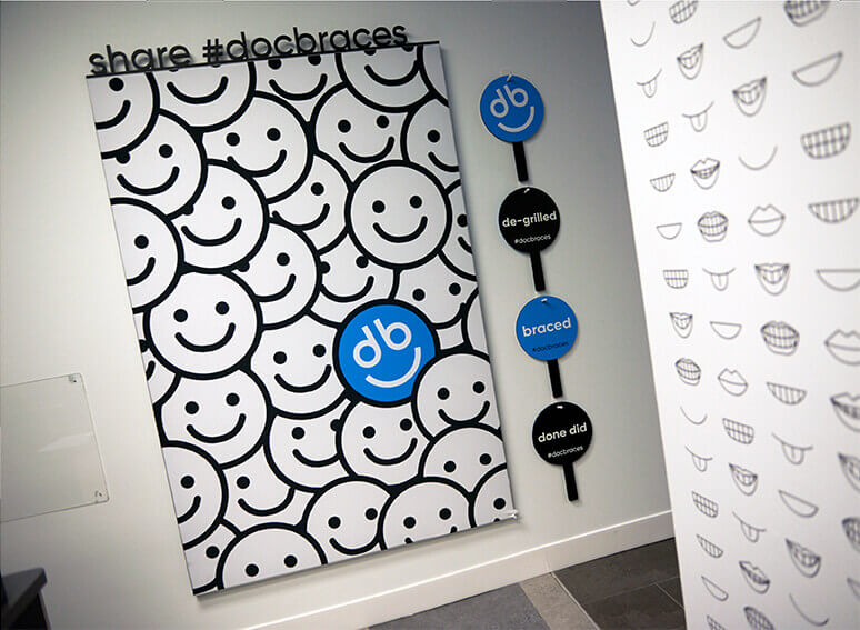
The visual identity for docbraces leans into the confidence a great smile provides. The use of lower-case font, playful graphics depicting humorous smiles and a fresh color palette speak to the welcoming personality of the brand. At the same time, the design had to be clean and modern, building confidence and trust with patients who may be anxious about their treatment.
SLD managed the execution stage of the clinic design refreshes, overseeing a wide range of applications of the various elements to over 45 clinics and counting. The result is a united brand with a confident, warm visual personality, building on the spirit of the community clinics that make up docbraces.
