As customer needs change and emerging technology enables new possibilities, retail channels need to adapt in order to stay relevant.
This pattern has been demonstrated throughout history. For example, before the 1900s, personal cars and home refrigerators were not widely used, so people would visit markets and convenience stores fairly often. After sub-urbanization began and these technologies became mainstream, a need for larger, destination-focused shopping trips emerged. In response, large department stores and shopping mall formats were developed to capitalize on these shopping occasions.
The same effect has occurred in recent years, but this time it has been largely influenced by e-commerce. Customers are now able to conveniently order products online, so retail stores have to be compelling or unique enough to make them worth visiting. Modern retail formats such as pop-ups, flagships, community spaces, and showrooms serve different purposes that go beyond transactions. Traditional formats still exist, but are in a battle with digital channels to remain relevant.
Since these formats are all different, they each require unique design considerations. How does a pop-up differ from a flagship store? How do you go about creating a showroom, community space, or concept store?
To design these spaces, it is important to assess each format’s purpose.
Pop-Ups and Flagships: Brand Expression
Both pop-up and flagship formats are often leveraged for brand expression.
Pop-ups are temporary and serve as a marketing tool to increase brand awareness, build brand connection, and offer product trial in strategic locations. They may be unexpected and experimental – such as the Pantone Cafe that promotes Pantone colors by serving “Pistachio Green” eclairs (Pantone 13-0221), “Verdant Green” salads (Pantone 19-6026), and “Water” (Pantone 5435 C).
Pop-ups can also give online brands a physical presence and an opportunity to engage with customers. For example, in Wayfair’s pop-up shops, potential customers can explore fabric swatches, get advice from home design experts, create custom furniture, and buy gift cards.
Since pop-ups are often in non-traditional or unusual spaces, their size and shape must be carefully considered, and an eye-catching, unique design will match their experiential nature. To keep the experience focused, branding elements and product offerings need to be curated.
Similarly, flagships also express the brand, but are permanent and larger in scale. This format’s role is to physically embody and represent the brand’s personality and values. Strong design is important, and the goal should be to attract customers to explore and spend time in the space and build emotional connections to the brand. In a flagship design, there is generally a higher budget and more freedom to be bold, creative, and/or include cutting-edge technology. Store footprint is usually larger as well, offering an opportunity to create multiple experiences and zones.
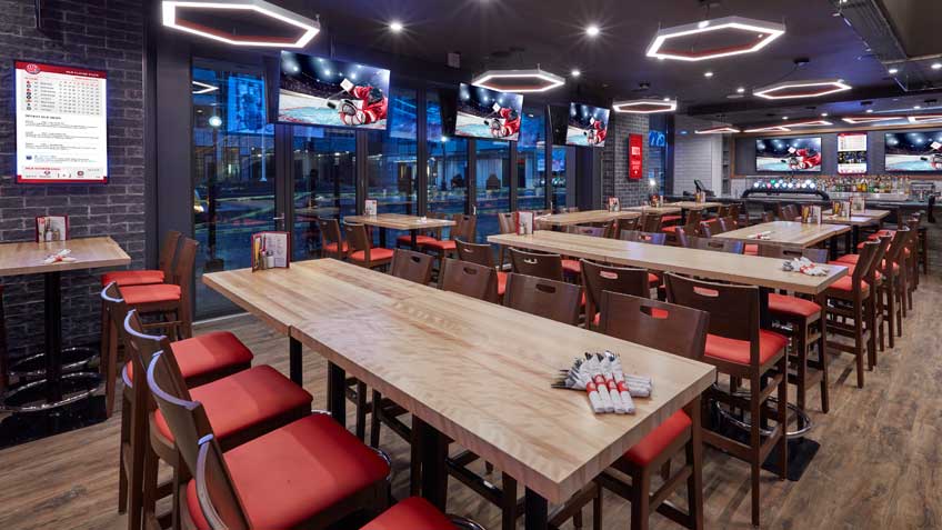
When designing the Boston Pizza flagship in Toronto (located near two major sports stadiums), the goal was to create an immersive and engaging brand experience, and be the ultimate sports entertainment restaurant and bar destination. A prominent entrance, location-inspired decor, contemporary materials, fun graphics, and large digital screens create a unique atmosphere.


Showrooms/Experience Stores: Product Trial, Customization, & Brand Engagement
Sometimes you want to actually see and feel a product in real life before buying it. Digital channels cannot completely meet this need (although VR and AR experiences help), so showroom and playground/experience store formats have emerged. This format offers product trial, customization and in-person brand experiences – and may not actually sell products (or might have digital kiosks available to order them). Designing a showroom is quite different than designing a traditional store. Space for customers to interact with products should be a priority, and samples of different options should be available to help visualize a product in use. For example, IKEA stores include showrooms with fully decorated rooms in which customers can sit on sofas and feel the material of a table.
Community Spaces: Creating Belonging
Another role that a physical store can play is to foster a sense of belonging and community. Brands that can do this will have more loyal and connected customers. To design this type of space, social interaction needs to be prioritized. Seating configurations, group tables, and interactive elements are all important to build a social space. A mixture of areas for private, small-group conversations as well as areas for informal mingling will create different dynamics. Food and beverages, events, and demonstrations can also help bring people together.
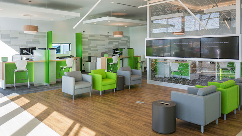
In the design of Regions Bank, a community feel was prioritized. Digital screens display community initiatives and a comfortable waiting area with a coffee bar is available. The teller line has also been replaced by banking stations that create a less intimidating experience.


Concept Stores: Exploring New Directions
Concept stores, such as Amazon Go, are important formats that encourage innovation and test new directions (like checkout-free technology). This format is experimental and therefore design can be more unusual and revolutionary. New materials, shapes, and technologies are options – and adherence to the brand guidelines are not as strict. For these reasons, there is more of an opportunity to offer novel experiences. For example, the design of the Chinese book store Zhongshuge leverages optical illusions to create a unique environment. While your brand may be less recognizable in a concept format, it is an opportunity to explore brand evolution. These stores may focus on one particular target audience, present a new product line, or showcase an alternate retail structure. A successful concept store may lead to key insights that will ensure future brand relevancy.
In-Line Stores & Kiosks: Spatial Constraints
An in-line store design will be limited by the buildings that it is attached to or resides within. Design may need to follow specific regulations and you might not be able to change the exterior. In this type of project, it is important to make the most of any opportunity to express the brand. Well-designed logos, window posters, and digital signage can help in-line stores stand out. Conversely, a stand-alone store usually has more freedom in its exterior architecture compared to a store that is inside or attached to other buildings. There is an opportunity for more unique entrances, walls, lighting, and structures. The stand-alone brand may also own more space around the store, which can be used to create gardens and seated spaces.
With a kiosk, size is one of the biggest considerations. This format exists for smaller spaces, so design elements need to be carefully selected to ensure that they are relevant and impactful. A more limited product assortment will also be necessary, however digital technology can enable visibility of more options. If a kiosk is inside a shopping center or airport, it may have an open layout rather than walls, so an overhead structure may need to be developed to create a cohesive feel and integrate displays within the kiosk.
When designing kiosk formats for The Source (located in airport environments), the brand experience of the larger stores had to be applied to a smaller space. Key design elements were included to entice travellers to stop and shop.
All of these formats serve different purposes and have different requirements, so the design of each one has unique considerations. Effective design will ensure that they are successful in their role and deliver compelling experiences to customers. To remain competitive, it is important that retail channels are constantly adapting to market shifts. As customer needs and technologies continue to evolve, there will be a demand for new retail formats that have not been imagined yet.

