
A new aisle for CPG brands has fragmented the path to purchase. As the line between social media and e-commerce gradually blurs, platforms like TikTok and Instagram aren’t just influencing buying decisions they’re becoming the shelf. With 34% of consumers shopping online at least once a week and 70% of online purchases influenced by social media, the future of CPG marketing lies in how effectively brands engage shoppers where they scroll.
How CPG Brands Can Win in Social Commerce
To win in social commerce, brands need more than just a “Buy Now” button, they need a strategy with the Blink Factor approach in mind. Our Blink Factor philosophy is rooted in the understanding that consumers make buying decisions in the blink of an eye. Social commerce is a powerful way to activate that “blink” moment, where it’s not just about selling, but about authenticity, emotional connection, and creating a frictionless shopping experience. Here’s how CPG brands can use the Blink Factor to win the online market:
Design for Both the Shelf and the Scroll
According to our research on E-commerce for CPG Key Consumers, 46% of online shoppers browse on their cell phones, yet poor product visibility remains one of their top frustrations. The challenge for CPG brands is to create packaging that not only stands out on shelf but also on a 6-inch screen, where thumbnail views and digital ads require clarity and style.
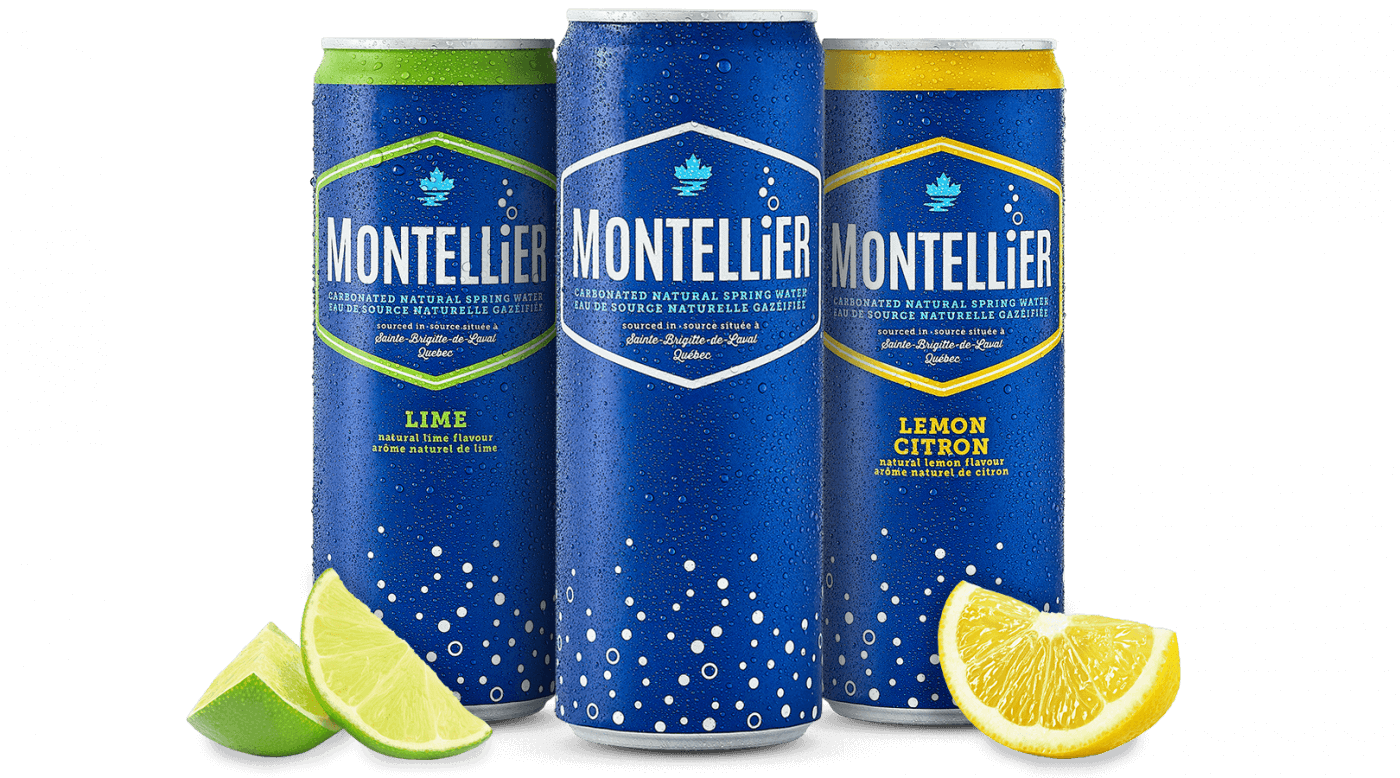
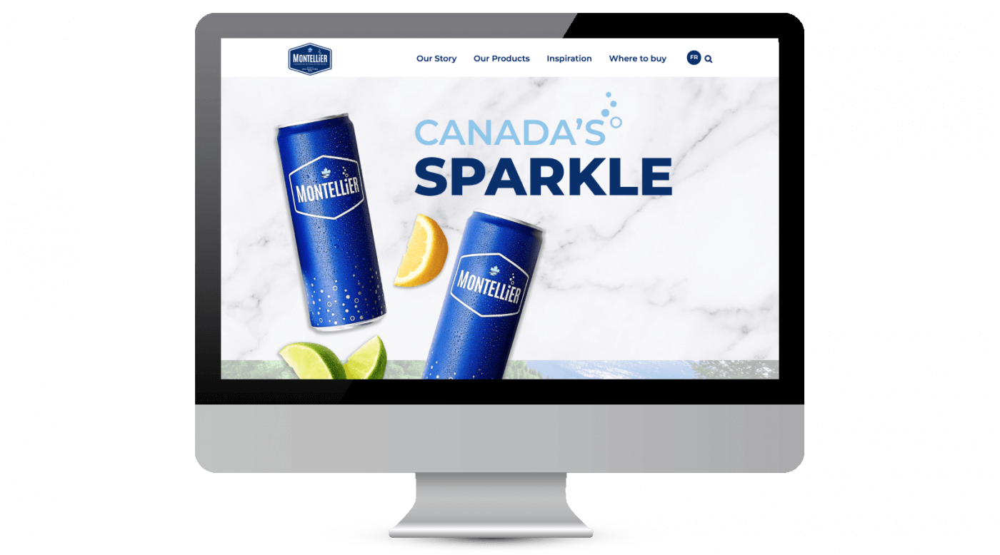
SLD’s redesign of Montellier sparkling water shows how packaging can transcend the shelf. The brand’s naturally sourced spring water from Quebec was a unique story waiting to be told. We brought it to life through clean, modern packaging designed for both physical and digital impact. A bold, deep blue became the brand’s signature, creating instant recognition. Local symbols like the fleur-de-lis and maple leaf offered regional storytelling cues that resonated with local pride, while lighthearted bubbles, fresh typography, and clear bilingual descriptors like “carbonated natural spring water” communicated quality and authenticity at a glance. The design translated seamlessly across formats, from sleek slim cans to mobile listings, and the Montellier website, where the story continued with lifestyle-driven content.
Blink Factor Tip: Optimize Product Descriptions
- Match digital visuals with real-world experience. Ensure lifestyle imagery online and on-pack design work together to tell a unified brand story. You can clean up the front of pack by removing claims for digital, but overall it should look and feel like the real thing.
- Consider including romance copy to create more engaging descriptions where permitted.
- Ensure you have additional information about your product available on your own site, including recipes, sourcing, and product benefits.
Image Source: SLD
Build Cohesive Brand Worlds
Product size and quantity play a crucial role in the online shopping journey. Shoppers seek clarity on value, so confusing pack formats or unclear sizing can cause drop-off. CPG brands must think strategically about how product variants are displayed and bundled in-store and online.
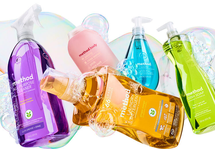
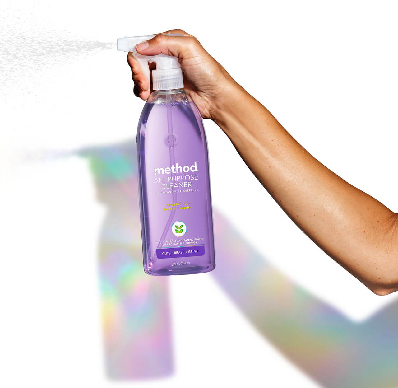
Method, a sustainable soap and cleaning brand, exemplifies the Blink Factor by aligning visual identity with consumer needs. Their signature bottle shapes, minimalist labels, and bold color-coding make each product visually pop while maintaining a cohesive aesthetic across categories from hand soap to all-purpose cleaners. Where Method shines is in the way it handles size and variant clarity. Online and in-store, the brand clearly differentiates between single units, refills, and multipacks, with the use of labels, bottle shape, and packaging design. The consistent naming and imagery help streamline the shopping experience. Their refill pouches, for instance, are distinct-looking, yet still clearly part of the Method brand, making it easy for consumers to understand their options in the blink of an eye.
Blink Factor Tip: Leverage High-contrast
- Use bold iconography, and color blocking to differentiate SKUS.
- Minimize clutter by reducing nonessential claims.
Image Source: Method Products Official Website
Make Micro-Moments for the Gen Z Shopper
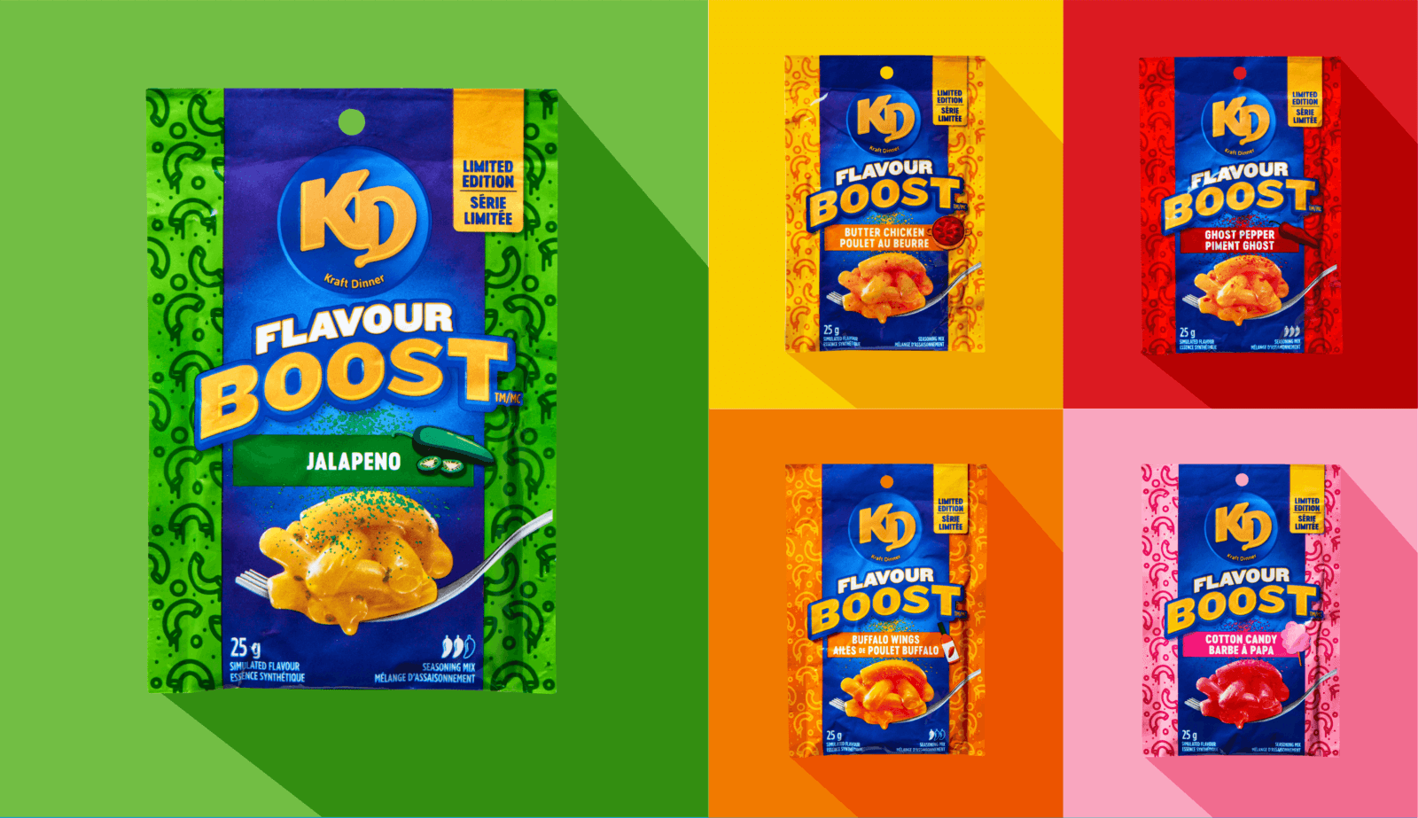
For Gen Z, prestige isn’t defined by price tags or designer labels, it’s about access, individuality, and being part of something that feels exclusive and culturally relevant. This generation is inspired by moments of discovery that align with their personal identity, whether it’s a surprise flavor drop, a unique design collaboration, or packaging that looks good on their feed. Our study reveals that Gen Z is twice as likely to shop at specialty stores compared to other age groups, showing a strong preference for novelty and giftable experiences.
This insight was key to our work with Kraft Dinner, where we helped the brand tap into Gen Z’s craving for bold, unconventional experiences for its limited-edition flavor boosts. While staying true to the KD brand, SLD created distinct packaging to reflect each of the novel flavors. The design mixes pop art visuals with tasty graphics and nostalgia. Leaning into bold limited-edition aesthetics in collectible formats, Kraft Dinner transformed a familiar SKU into a micro-moment that resonated with its Gen Z consumers.
Blink Factor Tip: Use Packaging as a Canvas for Timely, Culture-connected Content.
- Build packaging that prompts consumers to share by adding QR codes, hashtags.
- Consider seasonal packaging, offering limited-run collections or products, especially through highly relevant partnerships to drive excitement.
- Increase appeal with personalization of products, from flavor to package design, to personalized swag.
Image Source: SLD
Design For Social Proofing: Ratings and Reviews
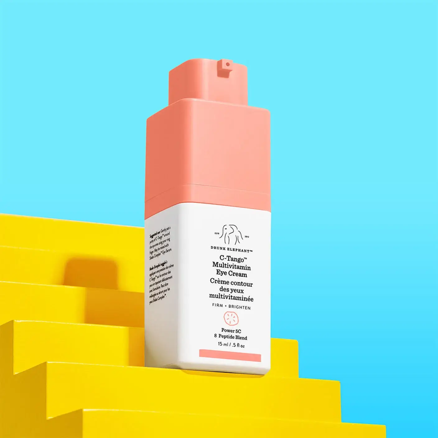
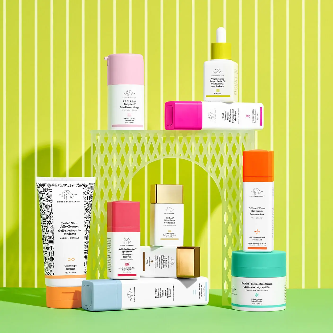
Consumers spend significant time reading product reviews before clicking “add to cart”. Our research shows that reading product reviews ranks third in the list of activities shoppers spend the most time on, especially in high-involvement categories like food and wellness. Younger consumers and higher-income earners are particularly attuned to transparency, ingredient quality, and brand values.
Drunk Elephant, a cult-favorite skincare brand, has excelled at designing its digital and packaging presence to support social proof and build customer trust. On their website, product pages prominently feature star ratings, top reviews, and ingredient call-outs. The brand’s packaging reinforces this transparency with clean labeling, front-of-pack ingredient highlights, and icons for vegan, cruelty-free, and fragrance-free formulas that speak to its consumer values.
Blink Factor Tip: Highlight Value
-
- Make reviews and benefits easy to find.
- Feature certifications, ingredients, and quality seals where they’re easy to see on digital platforms.
- Be responsive to reviews.
- Ensure your brand site includes comprehensive product information and that descriptions are detailed and easy to understand.
Image Source: Drunk Elephant Official Website
Takeaway
Social commerce is fast, visual, and emotionally driven – so are the best packaging strategies. Brands that thrive in social commerce aren’t just the loudest or most visible, they’re the ones that understand how to design for emotional impact. From packaging that earns a pause mid-scroll to culture moments that invite participation, CPG brands must be ready to connect anywhere and everywhere their consumers are online.
