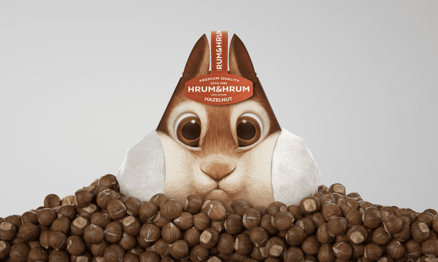
So, you have a great brand, exciting product, and are eager to share it with the world. You run advertisements and in-store campaigns, partner with influencers, and make sure that your product is available to be purchased online. However, without one crucial component, finding success may prove to be a challenge.
Whether online or in-store, packaging design helps differentiate brands, communicate key messaging, excite customers, and ensure a product is safe and fresh. At its best, product packaging can become your brand’s most recognizable asset – something that shoppers gravitate towards without consciously thinking about.
In a recent survey, 72 percent of consumers stated that packaging design can influence their purchase decision. At SLD, we call this the BlinkFactor – the fact that purchase decisions are driven by emotion and made in the blink of the eye. But how do you create this powerful connection through your packaging design? It’s a combination of art and science.
The Art Behind Good Packaging Design
NFTs, virtual museums, immersive exhibitions, online streaming… the ways in which people consume “art” are constantly changing. Why then, can’t your packaging design be viewed in the same way?
Creating a package that is aesthetically pleasing is the most obvious way to draw attention to your product and create a positive first impression – but choosing some nice imagery, eye-catching color and the right font is only one component. Thinking holistically about the story you want to tell can influence whether you go minimalist or maximalist, traditional or contemporary, vibrant or subtle. Viewing your packaging as a blank canvas opens up doors of creativity and can lead to something that consumers will hesitate to get rid of.
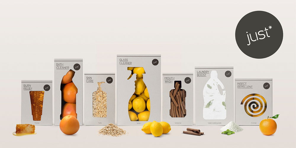
Just like art, packaging can also be provocative and educational. Take for example the WWF just* campaign, in which they used 100 percent natural and biodegradable packaging to promote natural alternatives to household products. What was great about this campaign was that the packaging wasn’t created as a separate entity, but was instead part of a larger initiative that also included advertisements and pop-ups.
As Andy Warhol said (or was it Marshall McLuhen?), “art is anything you can get away with,” and as competition for customer loyalty increases, creating a tactile reminder of your brand essence is a great way to stay top of mind and drive repeat purchases.

The Science Behind Good Packaging Design
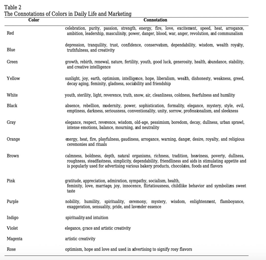
The field of behavioral economics allows us to study the impact that psychological, cognitive, emotional, cultural and social factors can have on the economic decision-making of a person. In marketing, we see examples of this through “buy one, get one free” offers, “sale ends today” prompts, and the focus put on online reviews. When it comes to packaging design, everything from the shape of the package to the amount of color saturation on the label can convey a certain feeling to shoppers and influence their purchase decision – even if it is subconscious.
In a study published in the Food Quality and Preference journal, it was confirmed that different sensory features associated with a package can influence taste expectations. While rounded shapes and typefaces are often associated with sweetness, angular shapes and typefaces lead to an expectation of sourness. Outside of the food industry, think about the sophisticated packaging of Apple or the luxurious packaging of Tiffany, and you quickly understand that a consumer’s expectations and aspirations can extend to the packaging that appeals to them.

Bringing It All Together
Of course, there are examples of packaging that thumb its nose at the status quo and have become iconic for very different reasons. No one is looking at LaCroix’s beverage packaging and thinking it deserves to be in the MoMA, but as designer Lyle Zimmerman explained, “In a sea of logos that were more sedate, precious in size, and often sans serif, the script denoted movement, energy, and fluidity—all traits applicable to water and especially the effervescence of LaCroix.” After all, rules are meant to be broken, and going against the grain is certainly one way to stand out.
At the end of the day, in order to create a packaging design that resonates with your target audience, you first need to have a deep understanding of that audience. What are they looking for in a product? What are their pain points? How can your product solve those needs, and how can your packaging get that point across? Innovation doesn’t have to stop with your products – in fact, it should only be the beginning.
