Digital experiences and communications, including websites, social media and digital content, play an essential role in influencing shopper decisions, but first it has to reach the right audience. Since the outbreak of the pandemic, online interactions have increased, as has competition for your consumer’s attention. Inclusive communication and marketing design is now more important than ever to ensure your content has maximum reach and the right appeal to its intended audience.
Ensuring your digital communication is inclusive means understanding how to present information in the clearest way possible. The great news is that being inclusive is a winning strategy – according to a recent survey by Google, 64 percent of people took an action after watching a campaign they considered inclusive. Let’s explore inclusive design for digital platforms and how brands can ensure their communications are reaching everyone.
What Is Inclusive Design?
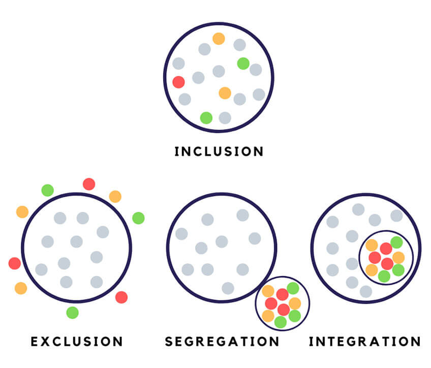
Imagine having a retail store on a busy street and the measures you would take to attract the attention of foot traffic. Designing for inclusion takes this effort one step further by making sure your store is accessible and relevant for people with all abilities. If excluding people means shutting them out from these measures and the store itself, inclusion means to bring them in. So, inclusive design ensures that we consider all different perspectives and abilities to guarantee that no one is shut out.
Kat Holmes, the author of Mismatch: How Inclusion Shapes Design suggests that even though the application of inclusive design is often in reference to people with disabilities, the most appropriate definition of “disability” is a mismatch interaction between the features of a person’s body and the features of the environment in which they live. According to Holmes, an inclusive design approach addresses issues beyond accessibility. It should not only be focused on people with permanent disabilities but acknowledge some mismatches that are temporary, situational or fluctuating.
For example, when we try to use our phones in broad daylight, we struggle with the screen glare and might attempt to click on links that are positioned too close to each other or try to view a video in a noisy outdoor area, and are unable to hear a word. Such an experience leaves us temporarily “mismatched” from the content.


When we talk about interactions designed in virtual environments, inclusive design minimizes this mismatch between the user and the environment or experience, making it accessible to a wider audience. Jutta Treviranus, Director of the Inclusive Design Research Centre at OCAD University discusses following three dimensions of the Inclusive Design framework:
1. Recognize, respect, and design for human uniqueness and variability.
2. Use inclusive, open & transparent processes, and co-design with people who have a diversity of perspectives, including people that can’t use or have difficulty using the current designs.
3. Realize that you are designing in a complex adaptive system.
How Does Inclusive Design Ensure Maximum Reach?
With work from home becoming a new normal, laptops and mobile phones have become our primary mode to access information as well as entertainment. This means to ensure successful brand communication, we need more omni-channel campaigns that offer a seamless experience to build upon messaging from one channel to another.
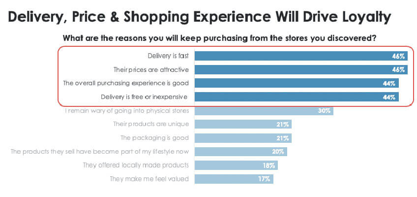
Your campaigns now have the opportunity to cast a wider net, given the increasing numbers of online shoppers. A recent study by Criteo also shows that the consumers are willing to experiment with new brands online if the overall experience is good.


At any given point in time, your brand’s online presence is accessible to a diverse audience passing by or scrolling through your content via social media feeds. An inclusive design experience that respects and speaks to more people will offer a better chance of increasing sales and penetration through light and new buyers. The Website Design Agency In Wirral can create the perfect inclusive design for your website.
Following are some ways in which you can start your journey to be more inclusive with your online marketing content. In some places, these may be legally enforced regulations based on the World Wide Web Consortium standards, also know as WCAG accessibility standards. But where not required by law, they are still best practices that we strongly recommend you follow:
Use Closed Captioning for Videos
Data from Facebook shows that branded content designed for sound off was rated as having 48 percent more relevance and 38 percent more brand interest.
Provide a Description For Images or an Alternative Text
An image description describes important elements in a photo while alternative text (or alt. text) is an invisible description narrated through a screen reader, allowing for those with visual impairments to interpret a photo.


Ensure Adequate Color Contrast for Visuals
There are a number of strategies to design clean and easy to navigate online experiences, such as reducing motion, limiting pop-ups or unexpected flashes. The simplest of all is ensuring adequate color contrast. Complementary colors will be highly effective, whereas adjacent colors in the color wheel will contrast less. Avoid contrasting hues from adjoining parts of the circle if those colors do not contrast in lightness. There are many online tools that can help you determine whether or not your color contrast is sufficient. WCAG requires a minimum contrast of 4.5:1 for text or images of text, with a requirement of 3:1 for large text.
Use Multi-Word Hashtags in CamelCase.
Don’t write your hashtags #THINKBLINK or #thinkblink. Instead, capitalize the first letter of every word #ThinkBlink. CamelCase make hashtags more legible for everyone.
Ensure an Inclusive Experience Across All Touchpoints
Brands should consciously consider the needs of all individuals and groups, including different cultures, languages, skin colors, religions and accessibility needs by maintaining the same user experience across the board. This requires brands to actively evaluate biases and assumptions that are built upon limited perspectives.
Conclusion
The amount of screen time that consumers spend has increased tremendously. Brands need to invest efforts in enhancing their online experience in response and ensure they are not shutting consumers out through unintended mismatches.

